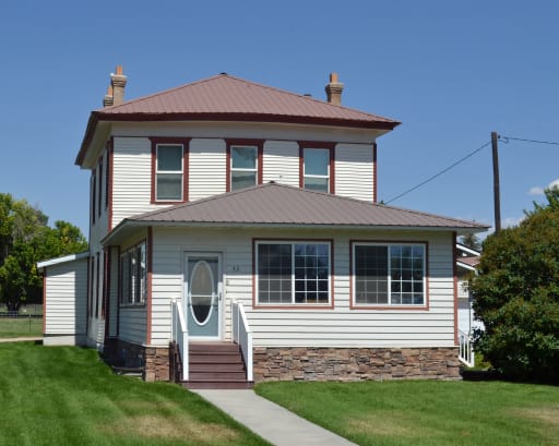
Responsive images using srcset, sizes and dynamic transformations
Resize your browser to see the image of the house change size.
- At viewport widths of 50em and higher, the image is 50em wide.
- At viewport widths lower than 50em, the image is resized to 100% of the viewport width.

